Starhead Digital

Store design

Shopify design services that make buying feel easy

Our Shopify design services cover research, UX and visual design for new stores and redesigns. We design mobile first, around how your customers shop, and hand over Figma files that are ready to build.

Brands we have designed for

FellerOcean State of MindPrince + BroomeSupa SuppsBeholderBodaLove by LilyLuna & WillowMovereRawwBahiaSalus SaunasMi AmorKartelRitzyWear This Not That

Design that does a job

Shopify design services exist for one reason: to help the right person find the right product and feel confident buying it. Looks matter, but clarity matters more. Within a few seconds a visitor should understand what you sell and why it is different, then move through collections without friction and find every detail that settles their doubts.

We work on both layers at once. Brand and visual craft set the tone, while UX decisions about navigation, product information, trust signals and the cart do most of the selling. Because our team also builds on Shopify every day, our designs respect how themes, sections, metafields and apps really work, so nothing gets lost between the Figma file and the live store.

We design for new brands launching their first store, established stores that feel dated, retailers bringing a physical experience online and Shopify Plus brands that need a consistent system across several storefronts.

  • Mobile-first layouts, since most store visits happen on phones
  • Navigation and filters built around how customers search
  • Product pages that answer questions before they are asked
  • A reusable design system, not a pile of one-off pages
  • Files your developers can build without guessing

Already live and unsure what to change? A Shopify UI/UX audit gives you a prioritized list first.

What our Shopify design services cover

Take the full set for a new store or redesign, or the pieces that matter most right now.

  • UX research

    We review analytics, heatmaps, session recordings, reviews and support questions to find where shoppers hesitate. Design starts from evidence, not taste.

  • Information architecture

    Menus, collections and filters planned around your catalog and the words customers actually use. Good structure makes a large range feel small.

  • Wireframes

    Low-detail layouts for key templates so structure and content order are agreed before color and type. Changing a wireframe is cheap; changing a finished design is not.

  • Visual design

    Typography, color, imagery style and components that carry your brand across every page. Each choice is checked for contrast and legibility on small screens.

  • Homepage design

    A first screen that says what you sell, clear routes into key collections and content that builds trust as people scroll. Built from sections so campaigns can reshape it.

  • Collection page design

    Product cards, filters, sorting and promotional tiles designed for quick comparison. Shoppers should be able to narrow a range with one thumb.

  • Product page design

    Gallery, variant selection, sizing help, delivery details, reviews and cross-sells arranged in the order buyers need them. This is often the highest-value page to get right.

  • Cart and checkout flow

    A clear cart drawer or page with honest totals, sensible upsells and checkout branding within Shopify’s settings. Fewer surprises mean fewer abandoned carts.

  • Mobile store design

    Every template is designed for phones first: tap targets, sticky add-to-cart, readable type and menus that work one-handed. Desktop is adapted from there.

  • Landing pages

    Campaign, launch and gift guide templates assembled from your section library. Marketing can reuse them without new design work each time.

  • Brand support

    For brands still taking shape, we define a practical visual system for the store: type pairing, color palette, buttons, icon style and photography direction.

  • Shopify Plus design

    Design systems that stretch across expansion stores, regional content, B2B views and checkout branding. Shared components keep several storefronts consistent.

Shopify store design, template by template

Each page type has its own job. Here is what we focus on in each, and why it matters for sales.

The homepage: orientation, not decoration

Many homepages try to say everything and end up saying nothing. A visitor arriving from an ad or a search needs three answers fast: what this brand sells, whether it is for them, and where to go next. We design the first screen around those answers, with one clear message, imagery that shows the product in use and a direct route into the main collections.

Below that, the page earns trust: best sellers, a short brand story, reviews or press, and a reason to sign up for email that is better than a generic discount banner. Every block is a theme section, so the page can change with the seasons without a redesign.

Collection pages: help people narrow down

Collection pages carry a lot of traffic and get little design attention. Shoppers use them to compare, so product cards need the right information at a glance: price, available colors, a clear image and badges such as new or low stock. Too much detail makes the grid noisy; too little forces people to open every product.

Filters should mirror how customers think about the range. A jewellery shopper filters by metal and stone, a supplement shopper by goal, a furniture shopper by size and room. We plan filters with the product data behind them, so what we design is something Search & Discovery and your metafields can actually deliver.

Product pages: answer every doubt in order

The product page has to replace the experience of holding the item. We design it as a sequence of answers: what is it, does it come in my option, will it fit or suit me, when will it arrive, what if it does not work out, and what do other buyers say. Each answer sits where the question comes up, not in a block of text at the bottom.

  • Gallery with detail shots, scale and lifestyle images
  • Variant pickers with swatches and clear stock messages
  • Size or fit guidance close to the selector
  • Delivery estimate and returns summary near add to cart
  • Reviews and user photos from tools like Judge.me in context
  • Specs, care and ingredients from structured metafields

Cart, checkout and the final steps

By the time someone opens the cart, the job is to remove reasons to stop. Totals should be honest, with shipping shown or estimated, discount fields clear but not distracting, and progress toward any free shipping threshold visible. Upsells work when they are relevant and few.

Shopify’s checkout is fast and trusted, and its layout is controlled by Shopify. We brand it with your logo, colors and typography through the checkout editor, and on Shopify Plus we can design extra content and fields with checkout extensibility. We design the thank you and order status pages as well, since they are a good moment to invite a review or a second purchase.

Mobile and accessibility as the baseline

We design phone layouts first because that is where most shoppers browse, and it forces clear priorities. Tap targets are large enough, the add to cart button stays reachable, text stays readable without zooming and menus work with one thumb. Desktop gets the extra space, not the extra ideas.

Accessibility is part of the same discipline. Sufficient color contrast, readable type sizes, visible focus states, labeled form fields and meaningful alt text help every shopper, including people using screen readers or keyboards. For a full review of an existing store, our Shopify accessibility audit goes into detail.

Inputs, tools and deliverables

What we ask for, what we use and what you receive at the end of a design project.

What we ask you for

  • Brand guidelines, logo and fonts if you have them
  • Product photography and lifestyle imagery
  • Access to Shopify analytics and Google Analytics
  • Best sellers and margin priorities
  • Common customer questions and complaints
  • Stores or brands you admire, and why

Research we run

  • Analytics review of key funnels
  • Heatmaps and session recordings where installed
  • Review and support ticket themes
  • Competitor and category walkthroughs
  • Mobile usability checks on your current store

Tools we design with

  • Figma for wireframes, designs and prototypes
  • Shared comment threads on every screen
  • Component libraries with variants and states
  • Shopify theme editor for checking feasibility

What you receive

  • Mobile and desktop designs for each template
  • A component library with states
  • A section map for the Shopify build
  • Content and image size guidance
  • Interaction notes for menus, filters and drawers
  • A clickable prototype of the main journey

Our Shopify website design process

Each stage ends with something concrete to review, so feedback stays focused and the design keeps moving.

  1. 01Listen

    Learn the brand and the buyer

    We talk through your brand, customers, best sellers and goals, and review your current store and competitors. We agree what a successful redesign or launch looks like.

  2. 02Research

    Find where shoppers struggle

    We review analytics, recordings, reviews and support questions to see where people hesitate or leave. Findings are summarized as a short list of problems to solve.

  3. 03Map

    Plan pages and journeys

    We map the main shopping journeys and wireframe key templates. Structure and content order are settled before color and type.

  4. 04Direction

    Set the visual direction

    We present a visual direction on one or two real pages using your products. Once approved, it guides every other screen and becomes the component library.

  5. 05Design

    Design every template

    We design mobile and desktop versions of each template in Figma, including empty, error and loading states. You comment directly on the files.

  6. 06Handoff

    Prepare for the build

    We deliver the component library, section map, specs and a prototype. Our developers or yours build from it, and we review the build against the design.

Designing for Online Store 2.0 and the build that follows

A store design is only as good as the theme it becomes. These are the habits that keep our designs buildable, fast and easy for your team to run.

A design system made of sections and blocks

Online Store 2.0 themes are built from sections, and sections are built from blocks. Merchants can add, remove and reorder both in the theme editor on almost any template. We design with that structure in mind from the first wireframe. Instead of drawing a homepage as one long picture, we draw it as a stack of named sections, such as an image banner, a featured collection, a text with image row and a review strip, each with the settings it needs.

This changes how the design is reviewed. Each section gets a short list of variations: with or without a heading, image on the left or right, light or dark background, two to four columns. Those variations become theme settings, so your team can build a new landing page from existing parts instead of briefing a designer every time. Fewer, well-defined sections usually beat dozens of near-duplicates that nobody remembers how to use.

Real content and structured product data

Designs that only work with perfect placeholder text break the week after launch. We design with your real product names, longest titles, shortest descriptions, missing images and awkward variant combinations. A product card has to cope with a sale price, a sold-out badge and a two-line title at the same time, and a hero banner has to survive a translated headline that runs longer than the English one.

Where a page shows repeating details such as ingredients, materials, care instructions, size charts or feature lists, we plan them as metafields or metaobjects rather than free text in the description. Shopify can connect these to theme sections through dynamic sources, so one product template can show different details for different products. It keeps pages consistent and makes later changes a data edit rather than a design job.

Speed is a design decision

Many slow stores were slow on paper before a line of code was written. Autoplay video in the first screen, three font families, a carousel in every section and an app widget on every product page all add weight. We make performance part of design review, so the visual direction and the speed budget are agreed together, not traded off in a panic after launch.

In practice that means one type family in a small set of weights, images sized for the space they fill, a static first screen rather than a slider, and native theme sections where an app would add extra scripts. Core Web Vitals depend on the build as much as the design, but a design that respects these limits gives developers a fair chance of passing them.

Design informed by conversion evidence

We treat every redesign as a set of hypotheses. If session recordings show shoppers scrolling past the size guide, we move it next to the size selector and note why. If support tickets keep asking about delivery times, the estimate goes near add to cart. Writing down the reason for each change makes it easier to judge the result later and to decide what to test next.

For stores with enough traffic, the riskiest changes can be tested before they are rolled out to everyone. For smaller stores, we rely on research and established patterns, then review analytics after launch. Either way, the design file records what we expected to happen, so the follow-up conversation is about evidence. Our Shopify CRO audit goes deeper when conversion is the main goal.

A handoff developers do not have to decode

Handoff is where good designs often lose detail. We reduce the guesswork by delivering a section map that names every section and block, notes which settings each one needs and links it to the Figma frames. Spacing, type styles and colors are defined as tokens that map onto theme settings, so a developer is not measuring pixels by hand.

We also design the states people forget: empty cart, no search results, out of stock, form errors, loading filters and long menus on small screens. During the build we review preview themes against the design and log differences in one shared list, so fixes happen before launch rather than as a stream of messages afterwards.

Our design checklist before handoff

Every template passes these checks before it goes to development, whether our developers build it or yours do.

Content and data

  • Longest and shortest real product titles tested
  • Missing image and single-image products covered
  • Sale, sold-out and pre-order states shown
  • Metafields and metaobjects listed for each detail block
  • Translated or regional text checked for length

Layout and breakpoints

  • Phone, tablet and desktop frames for each template
  • Sticky elements checked against small screens
  • Menus and filters shown open and closed
  • Tap targets sized for thumbs

Accessibility

  • Text and button contrast checked
  • Focus states designed for links, buttons and inputs
  • Form labels and error messages written
  • Alt text guidance for key imagery
  • No meaning carried by color alone

Performance

  • Font families and weights kept to a minimum
  • Image sizes and aspect ratios specified
  • No autoplay video or slider in the first screen without reason
  • App widgets reviewed against native sections

Build readiness

  • Section and block names agreed
  • Theme settings listed per section
  • Design tokens mapped to theme settings
  • Interaction notes for drawers, filters and galleries
  • Open questions logged with an owner

Refresh, redesign or redesign and rebuild

Not every store needs a full redesign. This comparison helps you choose the right size of project.

Targeted refreshFull redesignRedesign with new theme
When it fitsThe store works but a few pages underperformBrand has changed or the store feels datedThe current theme cannot support the new design
Pages coveredA few key templatesAll main templatesAll templates plus new sections
Navigation and structureLight changesReviewed and often reworkedReworked with the new theme
Design systemUses existing stylesNew or updated systemNew system built into the theme
Development effortSmall, within the current themeModerate customizationCustom theme build
Risk to current salesLowManaged with careful launchManaged with staging and testing
Good first stepUI/UX auditUI/UX or CRO auditTechnical audit plus design discovery

We often start with a short audit so the scope is based on evidence rather than a guess.

Shopify redesigns that show the approach

Design-led projects where structure, discovery and trust signals were rethought along with the visuals.

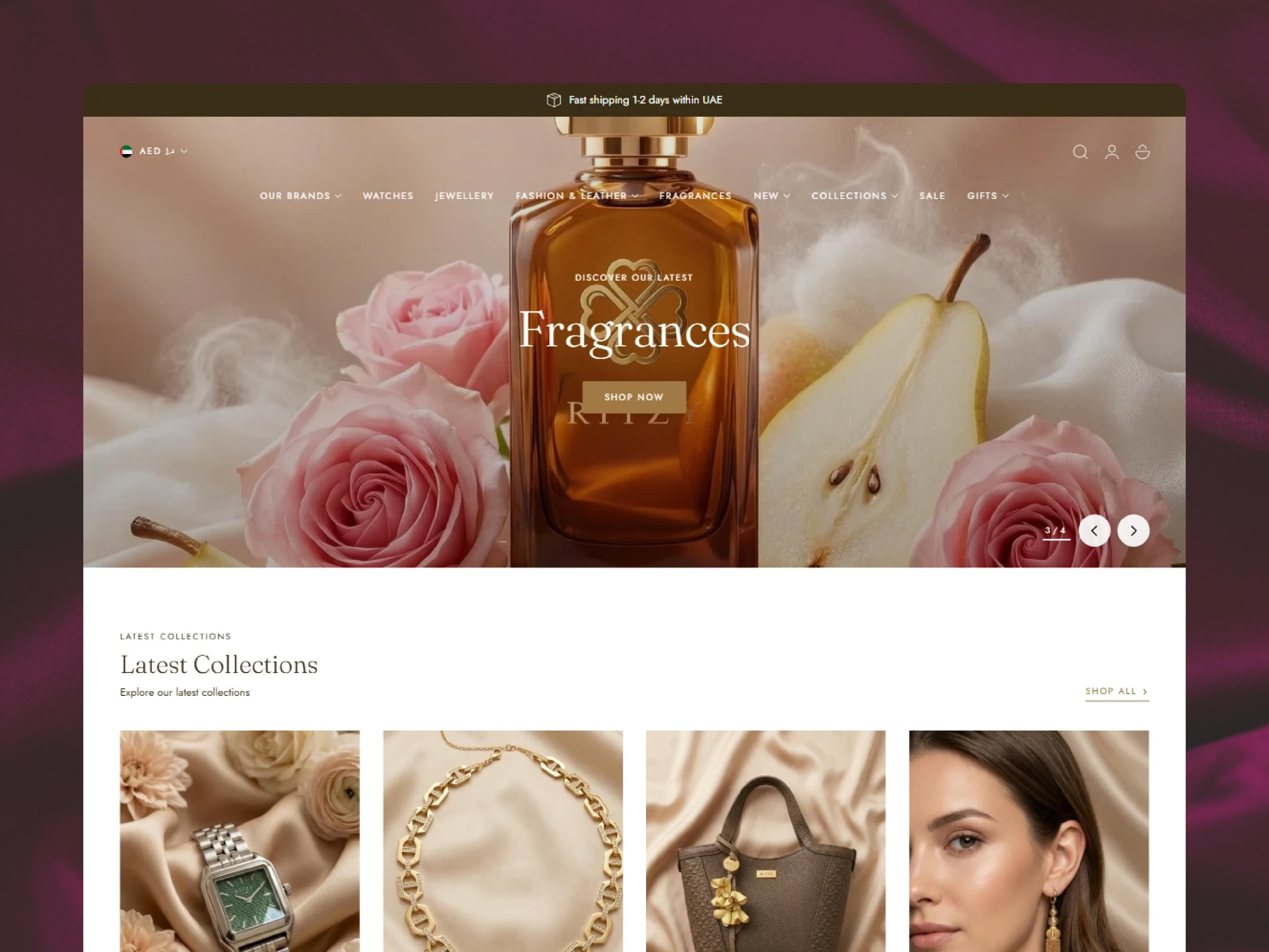
Ritzy Shopify store

Shopify Redesign

Ritzy

  • UX/UI Design
  • Theme Development
  • Shopify Search & Discovery
The problem
RITZY's growing retail presence and expanding international audience demanded a digital storefront that could match the brand's premium, culture-forward identity. The existing online experience lacked the visual refinement and…
What we built
We built RITZY's Shopify store development with a design language rooted in refinement, warmth, and cultural resonance. The layout was structured to foreground the brand's high-quality product photography, with clean typographic…
The result
The redesigned Shopify store gave RITZY a digital presence worthy of its status as a recognised Emirati jewellery brand. By translating the brand's in-store elegance into a fluid, performance-optimised online experience, the…
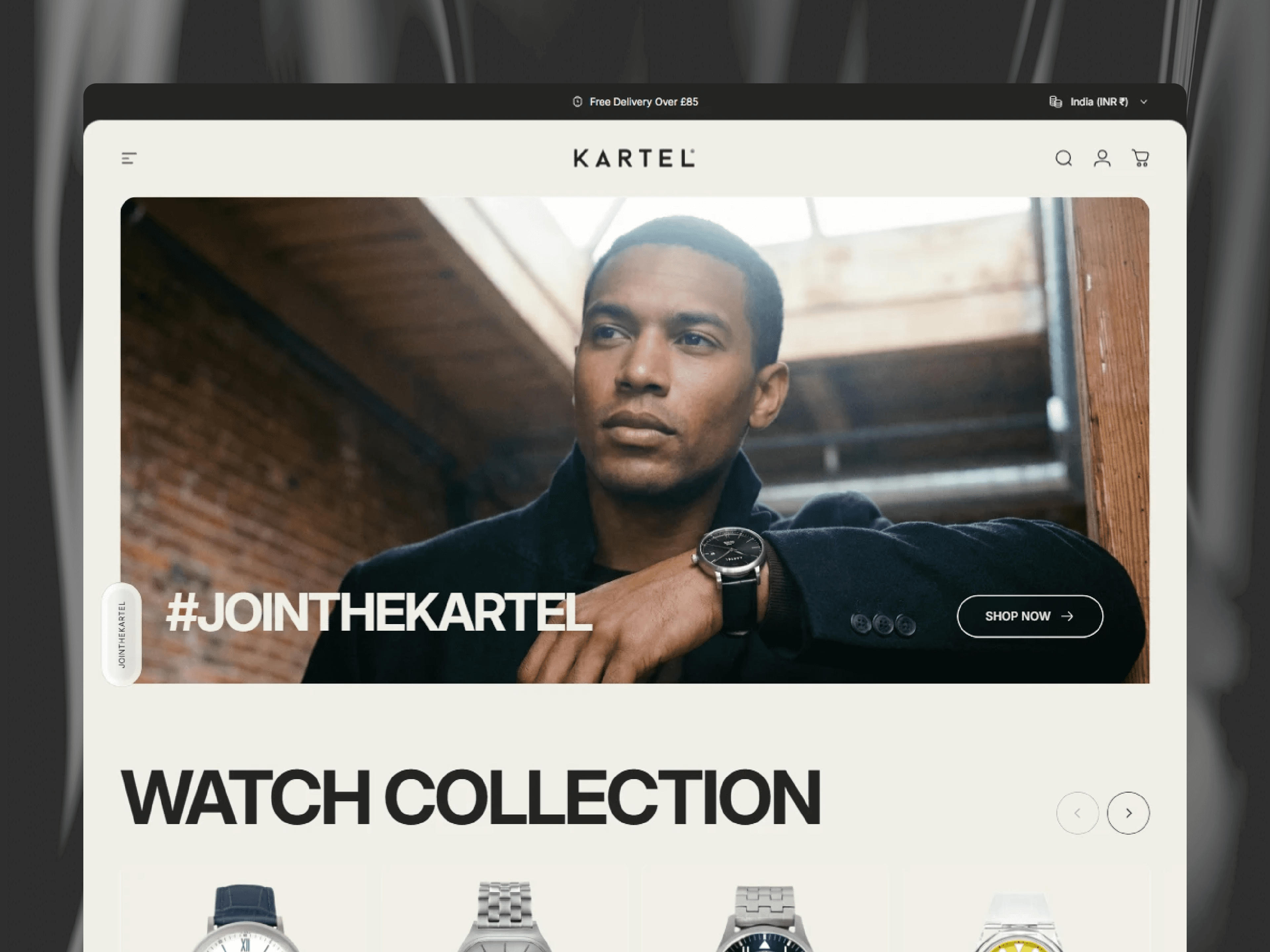
Kartel Watches Shopify store

Shopify Redesign

Kartel Watches

  • UX/UI Design
  • Theme Development
  • Performance Enhancement
  • Shopify Search & Discovery
  • Judge.me Product Reviews App
The problem
Kartel Watches faced limitations with their existing e-commerce platform. Looking for a fresh Shopify store design and a solution to support faster growth, they partnered with us for a complete redesign and rebuild.
What we built
We structured the site with clear and engaging navigation, segmenting it into Watches, Experiences, Accessories, Gift Cards, and About. This intuitive layout made it easy for customers to discover both products and experiential…
The result
The new Shopify Plus storefront for Kartel Watches elevated both the brand’s digital presence and customer experience. The immersive homepage and intuitive navigation encouraged deeper exploration across products and experiences…
BODA Shopify store

Shopify Development

BODA

  • UX/UI Design
  • Theme Development
  • Performance Enhancement
  • Shopify Search & Discovery
  • Judge.me Product Reviews App
The problem
BODA approached us with the goal of a complete full website redesign, aiming for a visually appealing brand aesthetic that would resonate with their customers.
What we built
We worked on several elements of BODA's store, including color, typography, and imagery, while also restructuring many of the site's core pages. Our work preserved the brand's integrity while creating a new UX that was designed…
The result
The new website for BODA successfully captures the essence of its "Functional Luxury" brand. The updated design and improved user experience have created a sophisticated digital presence that reflects the quality of their…
Ocean State of Mind Shopify store

Shopify Redesign

Ocean State of Mind

  • UX/UI Design
  • Theme Development
  • Performance Enhancement
  • Shopify Search & Discovery
  • Judge.me Product Reviews App
The problem
The boutique's original online presence struggled to capture the warm, curated, and community-focused essence of its physical stores. The website felt generic and disjointed, failing to translate the tactile, discovery-based…
What we built
We developed a clean, gallery-inspired design that prioritizes high-quality imagery and intuitive exploration. A custom, flexible navigation system was built to elegantly categorize the wide range of products: from jewelry and…
The result
The new website successfully bridges the gap between the brand's physical charm and its digital presence. The intuitive, minimal design has led to increased user engagement, with visitors spending more time exploring diverse…

Design problems we fix most often

These issues come up again and again when we review stores. Each has a clear design answer.

  • A first screen that says nothing

    A lifestyle image with a vague slogan leaves visitors guessing. We pair imagery with a plain statement of what you sell and a direct route in.

  • Menus that mirror the warehouse

    Navigation organized by internal categories confuses shoppers. We reorganize around how customers describe what they want.

  • Filters nobody can use

    Dozens of filter options with inconsistent values feel like a spreadsheet. We cut them to the attributes that matter and clean the data behind them.

  • Hidden delivery information

    Shipping costs and times buried in a policy page create doubt. We bring a short summary next to the add to cart button.

  • Variant confusion

    Dropdowns for color and size lead to wrong orders and returns. Swatches, size guides and clear stock messages fix most of it.

  • Reviews at the bottom of the page

    Social proof placed below everything else is rarely seen. We surface ratings near the price and place detailed reviews where doubt arises.

  • Pop-ups on arrival

    An email pop-up before the page loads interrupts people who have not seen a product yet. We time and design capture to feel like an offer, not a wall.

  • Inconsistent pages

    Years of one-off campaign pages leave a store with five button styles and three heading sizes. A component library brings everything back in line.

  • Desktop-first layouts

    Designs approved on a large monitor often fall apart on a phone. Starting with mobile makes priorities clear from the first sketch.

  • Low contrast and small type

    Light grey text on white looks refined and is hard to read. We keep contrast and sizes accessible without losing the brand’s feel.

Design choices that shape store speed

Common design decisions, what they cost in page weight, and the lighter option we usually suggest.

Heavier choiceLighter optionWhat you keep
First screenAutoplay video or a multi-slide carouselOne strong image with a clear messageA focused first impression that loads quickly
TypographySeveral font families and many weightsOne family in two or three weightsA consistent brand voice in type
Product imageryLarge images used at every sizeImages sized and cropped for each placementSharp photos without wasted data
Reviews and badgesA separate app widget for each elementNative sections fed by app data where possibleSocial proof with fewer extra scripts
Homepage lengthEvery collection and campaign at onceA short stack of sections with clear routesEasier scanning and faster loading
AnimationMotion on every element as it scrolls inSubtle motion on a few key elementsA lively feel that respects reduced motion settings

Final speed also depends on the theme code, apps and hosting of media, so we check performance again during the build.

Ways to work with our design team

Choose the format that fits your stage and how much design work you have coming.

  • Project

    New store design

    Research, structure and full visual design for a brand launching on Shopify. Pairs naturally with our store development service.

  • Project

    Store redesign

    A structured redesign of an existing store, starting from what your data says works and what does not.

  • Project

    Page-level redesign

    Focused work on the templates that matter most, such as the product page or homepage, inside your current theme.

  • Ongoing

    Design on retainer

    A dedicated Shopify designer for campaigns, landing pages and continuous improvements, working within your design system.

  • Partner

    Design for your developers

    We design and hand off to your in-house or agency developers with a section map and notes, and review their build.

  • Plus

    Multi-store systems

    For Shopify Plus brands with expansion stores, a shared design system with regional variations and consistent components.

Testimonials

What brands say about our design work

5.0from 8 client reviews

  • From creation of my site to working with them after for updates and changes to my site. The team goes above and beyond. Their communication, service and attention to detail is very good. They are wonderful to work with and very helpful with questions. I have found a team who believes in growth, creativity and good work ethic. Appreciate Starhead for always supporting our team!

    Alisha

    Ritzy

  • We are so happy with Starhead. They did an exceptional job at helping us create a new website with our new branding. We especially appreciate the good communication, the attention to details, the understanding and proactiveness. I am so happy we chose Starhead to help us, and 10/10 recommend them. We will continue to work with them in the future. Thank you so much for your work!

    Solveige Itervag

    Movere

  • ABSOLUTELY BEYOND AMAAZZING I HIGHLY HIGHLY RECOMMEND Prashant and Gaurav were super professional and kind. Their #1 goal is deliver everything you as the customer envision. Super detailed, very responsive, cares about the client Starhead Digital made every thing come true that i dream about having for my website I Definitely will be using Starhead Digital in future projects

    Julia

    Ocean State of Mind

  • It was a pleasure to work with Starhead Digital. They delivered the website extremely quick while also exceeding expectations of what we wanted. They ensured we were satisfied and were very communicative throughout the whole process. I will definitely be working with them again for any other projects, or even a website refresh. If you are looking for amazing quality work at a very reasonable price, I completely recommend!

    Chris

    Supa Supps

  • Very professional and focussed on exactly meeting my expectations. Any specifications I gave them they fully fulfilled or had an answer. I got quick replies to my questions at any time of the day and their communication in English is probably better than mine ';).
    Fully satisfied!

    Felix Brosi

    The Perfect Biquini(Bossa)

  • Working with Starheadtech was an absolute pleasure! They built and optimized our Shopify store beautifully — seamlessly integrating Google, TikTok, and Klaviyo. Their clear communication, problem-solving mindset, and clean custom coding truly stood out. Fast, professional, and genuinely results-driven. We're thrilled with our new site and can't recommend him enough!

    Jessica

    Love by Lilly

  • The team at Starhead digital was amazing to work with. They captured all the details I needed for an operational website. They were quick, understood the task, and even went above and beyond of the requirements. Thanks Prashant & team, would love to work with them again and recommend them to others.

    Sebastian

    Ina Malibu

  • Starhead Digital successfully helped us to migrate from Magento to Shopify. It was a great experience to work with them. The whole process was very much organize and smooth. The team was highly responsive, and internal stakeholders were particularly impressed with the Starhead Digital.

    Amy

    Salus Saunas

Common FAQs

Frequently asked questions

  • What are Shopify design services?

    Shopify design services are the planning and visual design of a Shopify store: research, navigation, wireframes, page layouts, product page design and a design system. With our Shopify design services, the output is a set of Figma files ready to be built as a Shopify theme.

  • Why does my Shopify store need professional design?

    Because design decides how quickly shoppers understand your offer, find the right product and trust you with payment. A professional designer works from your data and your customers’ questions, not just a template’s defaults, and plans a system your team can keep consistent.

  • Do you design both UI and UX?

    Yes. UX covers structure, navigation and how shoppers move toward a purchase, while UI covers the visual layer such as type, color and components. We work on both together, because one without the other rarely works well.

  • Can you redesign a store that is already live?

    Yes. We start by reviewing what works and what does not, using your analytics where available. Depending on what we find, we may suggest a refresh of key templates rather than a full redesign, which carries less risk to current sales.

  • Can you design custom Shopify product pages?

    Yes. Product page design is one of the most common parts of our work. We plan the gallery, variant selection, sizing help, delivery details, reviews and structured specs, and can create alternate templates for different product types.

  • Do you design Shopify Plus stores?

    Yes. For Plus brands we design systems that work across expansion stores, regional content and B2B experiences, and we can design additional checkout content using checkout extensibility.

  • Do you need our brand guidelines before starting?

    They help but are not required. If you have a logo, colors and fonts, we design within them. If your brand is still taking shape, we can define a practical visual system for the store covering type, color, buttons and imagery style.

  • Do you also build the design in Shopify?

    Yes. Our developers build designs as custom themes or as extensions of your existing theme. We can also hand files to your own developers with a section map and notes, and review their build against the design.

  • How long does a Shopify store design project take?

    It depends on the number of templates, the research involved and the rounds of feedback. A refresh of a few pages is much shorter than a full redesign with a new design system. We set a timeline once the scope is agreed.

  • How much do Shopify design services cost?

    Cost depends on scope: how many templates, how much research, whether a new design system is needed and whether we also build it. We quote after a short call and a look at your store or brand materials.

  • Do you provide design support after launch?

    Yes. Many brands keep a designer on retainer for campaigns, landing pages and improvements, so new work stays consistent with the system we created together.

  • Do your Shopify design services work with Online Store 2.0 themes?

    Yes. We design every page as a set of sections and blocks that map onto an Online Store 2.0 theme, so your team can rearrange and reuse them in the theme editor. Repeating product details are planned as metafields or metaobjects, which keeps templates consistent across the catalog.

Get started

Let’s design a store customers trust

Share your store or your brand guide and tell us what is not working. We will suggest where design can help most.

Let’s talk