Starhead Digital

UI/UX audit

Shopify UI/UX audit for a store that feels easy to shop

Our Shopify UI/UX audit reviews how your store looks, reads and behaves on every screen, finds the moments where shoppers get confused or stuck, and hands you annotated findings with a clear order of fixes.

Brands we have designed for

FellerOcean State of MindPrince + BroomeSupa SuppsBeholderBodaLove by LilyLuna & WillowMovereRawwBahiaSalus SaunasMi AmorKartelRitzyWear This Not That

A design review grounded in how people shop

This review looks at your storefront through the eyes of a shopper. Can they tell what you sell within seconds? Can they find the right collection, narrow it down and compare products without effort? Does the product page give them enough confidence to buy? Is the experience just as clear on a phone held in one hand on a crowded train?

We evaluate the store against established usability principles, your own analytics and the patterns shoppers expect from ecommerce. The audit is practical: every finding names the page and component, explains the problem in plain terms and suggests a change that can be built with your theme’s sections, blocks and settings.

It suits stores before a redesign, after a redesign that did not perform, when support tickets keep repeating the same questions, or when your team disagrees about what to change first and needs an outside view to settle it.

  • Independent view from designers who build Shopify stores every day
  • Findings backed by analytics and recorded behavior where available
  • Recommendations that respect your brand and existing theme
  • Separate pass for mobile, not an afterthought

You come away knowing what to keep, what to fix and what to rethink.

Areas the UX audit reviews

Thirteen areas, following the shopper from the first page they land on to the moment they reach checkout.

  • Heuristic evaluation

    Designers score each key template against recognized usability principles such as visibility of system status, consistency and error prevention. Every violation is logged with its location and a severity rating.

  • Information architecture

    How products are grouped into collections and how those collections are labeled. We check that the structure matches how customers think about your range, not how the catalog is stored internally.

  • Navigation and menus

    Menu labels, depth, mega menus, the mobile drawer and footer links. We test whether the most important routes can be reached in a couple of taps from any page.

  • Search and filters

    Predictive search, no-result pages, synonyms and filter design. We review your Shopify Search & Discovery setup and whether filters reflect the attributes buyers actually compare.

  • Homepage

    First-screen clarity, section order and routes into top collections. The homepage should serve both new visitors who need orientation and returning customers who want to get straight to new arrivals.

  • Collection pages

    Grid density, product card content, sorting, badges, swatches and pagination or infinite scroll. Small changes to product cards often change how far people browse.

  • Product pages

    Gallery, variant selection, sizing help, delivery and returns details, reviews and the add to cart area. We test whether the page answers the usual pre-purchase questions without hunting.

  • Cart and mini-cart

    Cart drawer versus cart page, quantity edits, upsells, free shipping progress and the path to checkout. Anything that adds doubt at the last moment gets flagged.

  • Checkout entry

    Branding, accelerated payment buttons and the handoff into Shopify Checkout, plus checkout extensions on Plus stores. We focus on the parts your store can control.

  • Mobile layouts

    Thumb reach, sticky elements, tap targets, text size and image cropping on real phones. Popups, chat widgets and announcement bars are checked for how much screen they steal.

  • Visual design and consistency

    Typography, color, spacing, button styles and imagery across templates. Inconsistency makes a store feel less trustworthy even when shoppers cannot say why.

  • Content and microcopy

    Headlines, product descriptions, button labels, empty states and error messages. Clear words remove friction as effectively as layout changes, and they cost far less to ship.

  • Accessibility basics

    Color contrast, focus states, alt text and keyboard access on core flows. For a full WCAG review we recommend pairing this audit with our dedicated accessibility audit.

Inside a Shopify UX audit

What each part of the review looks at, and why it is done that way.

UI and UX: two halves of one review

The UI side is about the interface itself: visual hierarchy, typography, color, spacing, icons and whether components look and behave the same way everywhere. A strong interface makes the store easy to scan and gives the important actions the right visual weight, so the add to cart button never competes with a newsletter banner.

The UX side is about the experience over time: whether shoppers can complete tasks, how many steps those tasks take, where they hesitate and what they need in order to feel confident. A store can look polished and still be hard to use, and a plain store can be very easy to shop. We review both together and show where one is undermining the other.

What a heuristic evaluation really is

Heuristic evaluation sounds academic, but the idea is simple. Experienced reviewers go through each template and compare it against a set of well-tested usability principles: does the interface tell people what is happening, does it use familiar words, does it prevent mistakes, can people undo an action, is it consistent from page to page.

On a Shopify store this turns into very concrete checks. Does the cart drawer confirm that something was added? Does the variant picker show which sizes are sold out before a shopper selects them? Do filter chips make it obvious how to clear a filter? Each issue is rated by severity, so cosmetic problems do not crowd out the ones that stop people buying.

Testing tasks, not pages

Pages do not convert; journeys do. So alongside the template review, we run realistic shopping tasks from start to finish: find a gift under a set budget, choose the right size for someone else, compare two similar products, return to a product seen yesterday. Each task is done on desktop and on a phone.

Where you have session recordings, we compare our findings with what real visitors did. When recordings confirm a problem we spotted, its priority goes up. When real visitors sail through a step we worried about, we say so, and that finding moves down the list.

  • Tasks chosen around your best-selling products and main customer types
  • Each task timed and counted in steps on both devices
  • Findings cross-checked against recordings where they exist

Why an audit should come before a redesign

Redesigns often fail for a simple reason: they are driven by taste. A new look ships, and the elements shoppers relied on, such as a clear size guide or a visible delivery estimate, quietly disappear. A UX audit beforehand gives the redesign a brief based on evidence, with a list of what to protect as well as what to change.

Sometimes the audit also shows that a full redesign is not needed. If the problems sit in navigation, product card content and mobile layout, targeted changes inside your current theme may deliver most of the benefit at a fraction of the effort. Either way, you make the decision knowing what is actually wrong.

Mobile gets its own review

For many stores the phone is the main storefront, yet design reviews still happen on large monitors. We review mobile as a separate pass on real devices, starting from the pages people actually land on from social and search, not from the homepage. Thumb reach, the order in which sections stack, how much of the first screen goes to banners, and whether the add to cart button stays reachable are all checked in context.

Mobile problems are often caused by layers rather than layout. An announcement bar, a sticky header, a cookie notice, a chat bubble and a discount popup can each be reasonable alone and together leave a narrow strip for the actual product. We list every layer, what it is for and whether it earns its space, so you can decide what to remove, delay or shrink.

  • Landing pages from ads and search reviewed first
  • Every overlay listed with its purpose and timing
  • Gallery, variant picker and buy button tested one-handed

What we check on each page type

A snapshot of the checklist behind the review. The full version adapts to your category and theme.

Homepage

  • Value proposition visible without scrolling
  • Clear routes into top collections
  • One primary action per section
  • Content for returning customers, not only new ones
  • Banner and slider usefulness on mobile

Collection pages

  • Product card shows price, variants and reviews
  • Filters match what buyers compare
  • Sorting options people actually use
  • Clear filter reset and result counts
  • Sensible grid density on phones

Product pages

  • Gallery quality, zoom and video
  • Variant picker shows availability clearly
  • Sizing or fit help close to the selector
  • Delivery and returns near the buy button
  • Reviews placed where doubts arise

Search

  • Predictive results with images and prices
  • Synonyms for common alternative terms
  • Helpful no-result page with routes out
  • Typo tolerance on key product names

Cart and checkout entry

  • Confirmation after adding to cart
  • Easy quantity and variant edits
  • Shipping threshold progress, if used
  • Accelerated payment options visible
  • No surprise costs before checkout

Mobile

  • Thumb-friendly navigation and buttons
  • Sticky add to cart that does not cover content
  • Popups that are easy to dismiss
  • Readable text without zooming
  • Images cropped for portrait screens

Our UX audit process

Structured enough to be thorough, short enough to keep momentum.

  1. 01Context

    Learn your customers and goals

    We talk through who buys from you, your best sellers and what you suspect is not working. We also review analytics, support themes and any past research or surveys.

  2. 02Data scan

    Find the pages that matter most

    Analytics shows which templates carry the most traffic and revenue and where exits cluster. That decides where the review goes deepest.

  3. 03Heuristic review

    Evaluate against usability principles

    Designers review each key template against usability heuristics and ecommerce conventions. Issues are logged with screenshots and severity as we go.

  4. 04Task testing

    Complete real shopping tasks

    We run core tasks on desktop and mobile and compare the results with recorded sessions where available. We also look at how strong stores in your category handle the same moments, to understand expectations rather than to copy.

  5. 05Prioritize

    Score impact and effort

    Every finding gets an impact and effort score, and we group them into quick wins, planned design work and larger structural changes. Wireframes are drawn for the changes that words cannot describe.

  6. 06Handover

    Walk through the findings

    We present everything on a call with your team and answer questions. If useful, we also scope what it would take for us to design and build the changes.

Without a UX audit vs after one

How decisions about your storefront change once there is evidence behind them.

Without a UX auditAfter the UX audit
Design decisionsBased on taste or the latest competitor visitBased on findings tied to real shopper behavior
NavigationMirrors the internal catalog structureMatches how customers describe what they want
Product pagesKey facts hidden in tabs and footersAnswers placed next to the buy decision
MobileDesktop layout squeezed onto a small screenA reviewed experience with its own fixes
Redesign briefA list of things the team dislikesA list of what to keep, fix and rethink
Team alignmentLong debates about what to changeOne ranked list everyone works from
Developer handoffScreenshots with loose commentsAnnotated screens and theme build notes

Deliverables you can hand to any team

Made to be used by designers, developers and marketers, not filed away.

UX audit report

  • Summary of the main themes
  • Findings grouped by template
  • Problem, impact and recommended change for each
  • Severity rating per finding

Prioritized fix list

  • All findings in one sheet
  • Impact and effort scores
  • Quick wins separated from design projects
  • Owner suggestions: design, development or content

Visual material

  • Annotated desktop screenshots
  • Annotated mobile screenshots
  • Wireframes for the highest-impact changes
  • Examples of patterns that suit your category

Build guidance

  • Sections, blocks and settings each change touches
  • Metafields needed for new product content
  • App changes or removals worth considering
  • Walkthrough call with your team

Redesigns shaped by UX problems

In each of these projects, the starting point was a store that made shopping harder than it should be.

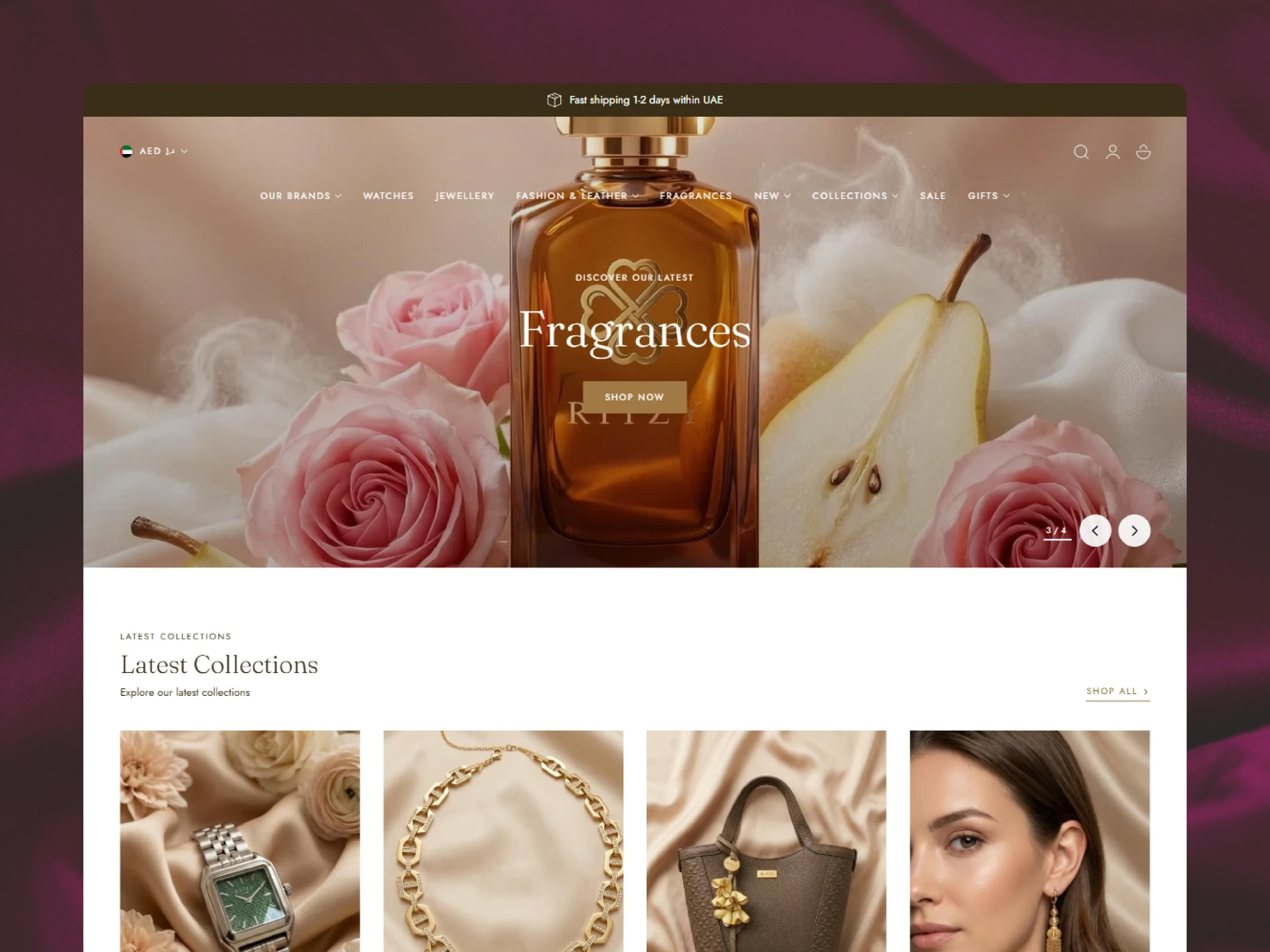
Ritzy Shopify store

Shopify Redesign

Ritzy

  • UX/UI Design
  • Theme Development
  • Shopify Search & Discovery
The problem
RITZY's growing retail presence and expanding international audience demanded a digital storefront that could match the brand's premium, culture-forward identity. The existing online experience lacked the visual refinement and…
What we built
We built RITZY's Shopify store development with a design language rooted in refinement, warmth, and cultural resonance. The layout was structured to foreground the brand's high-quality product photography, with clean typographic…
The result
The redesigned Shopify store gave RITZY a digital presence worthy of its status as a recognised Emirati jewellery brand. By translating the brand's in-store elegance into a fluid, performance-optimised online experience, the…
Movere Shopify store

Shopify Redesign, Rebranding

Movere

  • UX and UI Design
  • Custom Shopify Theme Development
  • Shopify Search & Discovery
  • Judge.me Reviews Integration
  • Klaviyo integration
The problem
A brand built on intention, quality, and effortless movement needed a digital home that felt the same way. The store MOVERE needed at launch had to do three things at once. Mirror the elevated positioning of the brand. Put…
What we built
One rule sat at the center of the build. Let the product lead. Design came first. A minimal layout, generous whitespace, restrained typography, and a neutral palette gave every piece the room it needed to feel premium…
The result
MOVERE now has a digital flagship that lives up to the brand behind it. Elevated, fast, effortless across every device. Product discovery is sharper, built around how real customers actually browse. Trust signals land earlier in…
Wear This Not That Shopify store

Shopify Development

Wear This Not That

  • UX/UI Design
  • Theme Development
  • Performance Enhancement
  • Store Optimization
  • Shopify Search & Discovery
The problem
Despite turning heads in the fashion world, Wear This Not That faced challenges with their e-commerce presence. Their online store was visually outdated, lacked a properly organized inventory, and failed to fully capture the…
What we built
We partnered with Wear This Not That to create a bespoke Shopify store that emphasized storytelling, sustainability, and ease of navigation. Their product catalog was restructured into clear, shoppable categories, supported by an…
The result
The redesigned Shopify store positioned Wear This Not That as a digitally forward fashion brand with a seamless and visually compelling customer experience. Clear navigation and improved search functionality enabled customers to…
Ocean State of Mind Shopify store

Shopify Redesign

Ocean State of Mind

  • UX/UI Design
  • Theme Development
  • Performance Enhancement
  • Shopify Search & Discovery
  • Judge.me Product Reviews App
The problem
The boutique's original online presence struggled to capture the warm, curated, and community-focused essence of its physical stores. The website felt generic and disjointed, failing to translate the tactile, discovery-based…
What we built
We developed a clean, gallery-inspired design that prioritizes high-quality imagery and intuitive exploration. A custom, flexible navigation system was built to elegantly categorize the wide range of products: from jewelry and…
The result
The new website successfully bridges the gap between the brand's physical charm and its digital presence. The intuitive, minimal design has led to increased user engagement, with visitors spending more time exploring diverse…

Common UX problems we find

Every store is different, but these patterns come up again and again, and most are cheap to fix once named.

  • Menus built around the catalog

    Category names that make sense to the team but not to customers, or collections nested too deep to find. Wear This Not That had content split across separate microsites before we pulled it into one structure.

  • Key facts hidden in tabs

    Sizing, materials, delivery times and returns tucked into collapsed tabs that most shoppers never open. Moving two or three of them into view often helps more than a new layout.

  • Weak product cards

    Cards without clear prices, variant hints or review signals force people to open every product just to compare. Swatches and a rating line can change browsing behavior quickly.

  • Filters that do not filter

    Filters built on tags that are applied inconsistently return results that feel random. Shoppers stop trusting them and fall back on scrolling.

  • Sticky clutter on mobile

    Announcement bars, chat bubbles, cookie banners and popups stack over content until the product barely fits on screen.

  • Unclear primary action

    Several buttons with equal weight on one screen leave shoppers unsure which one moves them forward. One clear primary action per section fixes most of it.

  • Generic search results

    A search for a common term returns blog posts and pages before products, or nothing at all because the store uses a different word. Synonyms and result tuning solve much of this.

  • Imagery that hides the product

    Lifestyle photos cropped so tightly on mobile that the product disappears. The Perfect Biquini and Ritzy both depended on layouts that frame imagery rather than fight it.

  • Inconsistent components

    Three different button styles, mismatched badge colors and headings that change size between templates. Each one small, together they make a store feel assembled rather than designed.

  • Empty and error states ignored

    Empty carts, sold-out variants and failed discount codes shown with blank space or a technical message. These moments deserve a helpful next step.

Who the UX audit is for

The review adapts to where your store is today.

  • Brands planning a redesign

    Get an evidence-based brief before any design work starts, so the new store keeps what works and fixes what does not.

  • Stores after a disappointing launch

    A new theme looks better but sales did not follow. We find what changed for shoppers and what can be restored or improved.

  • Growing catalogs

    Navigation and filters that worked for fifty products often break at five hundred. The audit reviews structure before it becomes a bigger problem.

  • Teams that disagree

    Founders, marketers and developers each have a different list. An independent review gives everyone one shared, ranked list to work from.

  • Stores entering new markets

    New regions bring new languages, currencies and expectations. We check that the experience holds up for visitors who do not know your brand yet.

  • Shopify Plus merchants

    Plus stores with checkout extensions, multiple markets or B2B catalogs get those flows included in scope from the start.

How to judge any UX audit proposal

Whether you work with us or someone else, these questions separate a useful audit from a generic one.

  • Does it use your data?

    An audit built only on opinion is a design critique. Ask whether the reviewer will look at your analytics, exits and recordings, and how those will change the priorities.

  • Is mobile tested on devices?

    Resized browser windows miss tap targets, overlays and real scrolling behavior. A good proposal names the devices and the journeys that will be tested on them.

  • Are findings ranked?

    A long list of issues with equal weight is hard to act on. Look for severity or impact scores and an explicit split between quick wins and larger work.

  • Does it understand Shopify?

    Advice that ignores how themes, sections and apps work can be expensive to build. Each recommendation should say what part of the store it touches.

  • Will you see the problems?

    Annotated screenshots and short recordings make findings easy to share with designers and developers. Text-only reports tend to be misread.

  • Is the audit independent?

    If the audit is a sales step for a rebuild, its conclusions may lean that way. Ask whether the findings are yours to use with any team.

Testimonials

What brands say about working with us

5.0from 8 client reviews

  • From creation of my site to working with them after for updates and changes to my site. The team goes above and beyond. Their communication, service and attention to detail is very good. They are wonderful to work with and very helpful with questions. I have found a team who believes in growth, creativity and good work ethic. Appreciate Starhead for always supporting our team!

    Alisha

    Ritzy

  • We are so happy with Starhead. They did an exceptional job at helping us create a new website with our new branding. We especially appreciate the good communication, the attention to details, the understanding and proactiveness. I am so happy we chose Starhead to help us, and 10/10 recommend them. We will continue to work with them in the future. Thank you so much for your work!

    Solveige Itervag

    Movere

  • ABSOLUTELY BEYOND AMAAZZING I HIGHLY HIGHLY RECOMMEND Prashant and Gaurav were super professional and kind. Their #1 goal is deliver everything you as the customer envision. Super detailed, very responsive, cares about the client Starhead Digital made every thing come true that i dream about having for my website I Definitely will be using Starhead Digital in future projects

    Julia

    Ocean State of Mind

  • It was a pleasure to work with Starhead Digital. They delivered the website extremely quick while also exceeding expectations of what we wanted. They ensured we were satisfied and were very communicative throughout the whole process. I will definitely be working with them again for any other projects, or even a website refresh. If you are looking for amazing quality work at a very reasonable price, I completely recommend!

    Chris

    Supa Supps

  • Very professional and focussed on exactly meeting my expectations. Any specifications I gave them they fully fulfilled or had an answer. I got quick replies to my questions at any time of the day and their communication in English is probably better than mine ';).
    Fully satisfied!

    Felix Brosi

    The Perfect Biquini(Bossa)

  • Working with Starheadtech was an absolute pleasure! They built and optimized our Shopify store beautifully — seamlessly integrating Google, TikTok, and Klaviyo. Their clear communication, problem-solving mindset, and clean custom coding truly stood out. Fast, professional, and genuinely results-driven. We're thrilled with our new site and can't recommend him enough!

    Jessica

    Love by Lilly

  • The team at Starhead digital was amazing to work with. They captured all the details I needed for an operational website. They were quick, understood the task, and even went above and beyond of the requirements. Thanks Prashant & team, would love to work with them again and recommend them to others.

    Sebastian

    Ina Malibu

  • Starhead Digital successfully helped us to migrate from Magento to Shopify. It was a great experience to work with them. The whole process was very much organize and smooth. The team was highly responsive, and internal stakeholders were particularly impressed with the Starhead Digital.

    Amy

    Salus Saunas

Common FAQs

Frequently asked questions

  • What is a Shopify UI/UX audit?

    A Shopify UI/UX audit is an expert review of how easy your store is to understand, browse and buy from. It combines heuristic evaluation, task testing and your analytics, and ends with annotated findings and a ranked list of design and usability fixes.

  • Which areas are reviewed in a Shopify UX audit?

    We cover information architecture, navigation, search and filters, the homepage, collection and product pages, cart and checkout entry, mobile layouts, visual consistency, microcopy and accessibility basics. Depth on each area follows where your traffic and revenue concentrate.

  • How does a UI audit differ from a UX audit?

    A UI audit focuses on the interface, such as layout, typography, color and consistency, while a UX audit focuses on how easily shoppers complete tasks and how confident they feel. We review both together because visual choices and usability problems usually affect each other.

  • Should I do a UX audit before a Shopify redesign?

    Yes, it is one of the best times to do one. The audit shows what already works and must be kept, and what needs to change, so the redesign is based on evidence rather than taste.

  • Does a UX audit improve conversion rates?

    A UX audit identifies friction that stops people buying, and fixing that friction often helps conversion. We do not promise specific numbers, because results depend on which fixes you ship and on your traffic, but findings are ranked by likely effect.

  • What is a heuristic evaluation?

    It is a method where experienced reviewers check each page against established usability principles, such as consistency, clear feedback and error prevention. Each issue is logged with its location and severity, so the most serious problems are dealt with first.

  • Do you test with real users?

    Our core method is expert review plus task testing on real devices, cross-checked against your session recordings where you have them. If you want moderated sessions with your own customers, we can plan them as an extension of the audit.

  • Do you review the Shopify checkout?

    We review the path into checkout and the parts you can customize, such as branding, accelerated payment options and checkout extensions on Shopify Plus. The core checkout flow is managed by Shopify, so we focus on what your store controls.

  • What do you need from us to start?

    Collaborator access to the store, read access to analytics, any behavior tool you use, and a short conversation about your customers and goals. Past research, support themes and a list of known complaints are helpful but not required.

  • Can you implement the recommendations?

    Yes. Our designers and Shopify developers can design and build the changes after the audit, under a separate scope. The report also stands on its own if you prefer to use your in-house team or another partner.

  • Can you review a Shopify Plus store?

    Yes. Plus stores often have more markets, more custom features and checkout extensions, and we include those in scope when we plan the audit.

Get started

See your store the way shoppers do

Send us your store and a few lines about your goals. We will recommend the right audit depth and next step.

Let’s talk